Whether you call them banners, headers, heroes, or carousels, one thing is certain: they are an essential component of eCommerce success.
They’re likely to be one of the first things your customers see when they land on your homepage, so it’s important to get them right. If done correctly, they can drive sales and conversions. But if they are created carelessly, they might confuse customers instead.
In this blog post, we’ll be laying out the banner basics. This is helpful to know regardless of whether you’re creating the banner yourself or hiring a designer. After all, the clearer and more specific your brief, the less room for interpretation there is.
Sizing
When it comes to your banner size, the choice you make should depend on the purpose of the banner within your homepage.
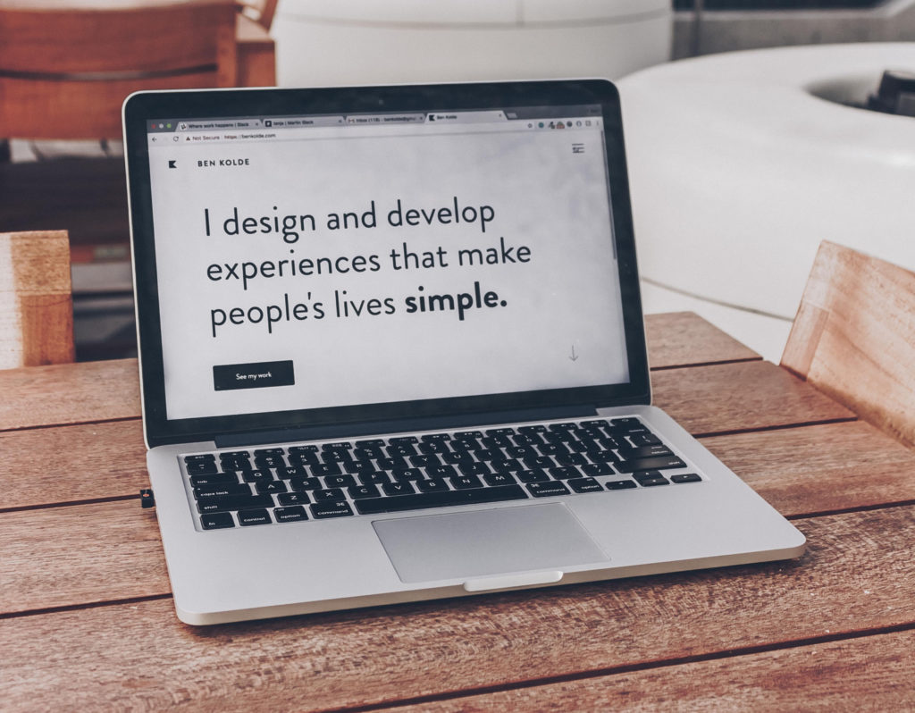
If you have one central message that you really want to drive home, a full-page background image will work best.
However, if you want to show off multiple products or direct visitors to different areas of your website, a smaller banner will be more useful. Here are some examples:
Slack
Slack has opted for a full-page animated background image. The navigation is tucked away which means your immediate focus is on the visuals. This suits their business because they are selling one product, so only have one central message. The animation and simple design give their homepage a modern feel, which is consistent with Slack’s branding.
Pretty Little Thing
Pretty Little Thing has chosen a slightly smaller banner. The primary purpose is to draw attention to their current collaborative collection with Maya Jama, which is a key selling point.
Using a smaller image leaves room for PLT to promote their valentines collection and boast about their delivery deals, which is often a deciding factor for customers when deciding whether to complete a purchase.
Banner sizes are measured in pixels and, if you can’t already tell from the examples above, work better in landscape rather than portrait. The 6 most popular banner sizes are: 1920 x 1080, 1280 x 375, 1170 x 569, 1024 x 300, 800 x 200 and 570 x 274. We recommend that 1920 x 1080 is the biggest that you go, beyond this and the size will begin to affect your website’s speed. Your banners can be any size you wish, however, as a general rule of thumb we recommend that they are wide and short rather than thin and long.
Images
A good banner isn’t possible without good photography. Photos are one of the key factors in determining whether visitors continue scrolling through your site or leave and take their custom to a competitor.
If you’re going to be shooting your own banner photos, remember to follow a 4:1 ratio. Banners look better when they’re wide and short.
Furthermore, remember to shoot your photos in landscape mode to maximise your photo’s usability. It’s really difficult to crop a portrait photo to landscape whilst still retaining your subject’s full visibility.
A good tip for creating visually compelling photos is to follow the rule of thirds. This dictates that the subject matter of your photo should be aligned with the central crossover points of your image, which are found by dividing your picture into thirds (see example below). This also ensures there’s adequate room for text.
If your business is just starting out, you may not have the budget to pay for professional photos or photography equipment. Whilst smartphone cameras will suffice, not all of us have a knack for photography.
If you’ve found yourself in this situation don’t worry! There are plenty of free stock image websites where you’ll be able to find beautiful banner images, here are some of our favourites:
- Pixabay
- Pexels
- Unsplash
- Shopify Burst
- Graphic Burger (also do really cool mock-ups)
- PicJumbo
- Morguefile
- Freerange
- Pikwizard
- The Stocks (this amazing tool combines all of the above into one portal which means you don’t have to have 50 different tabs open!)
Colour Scheme
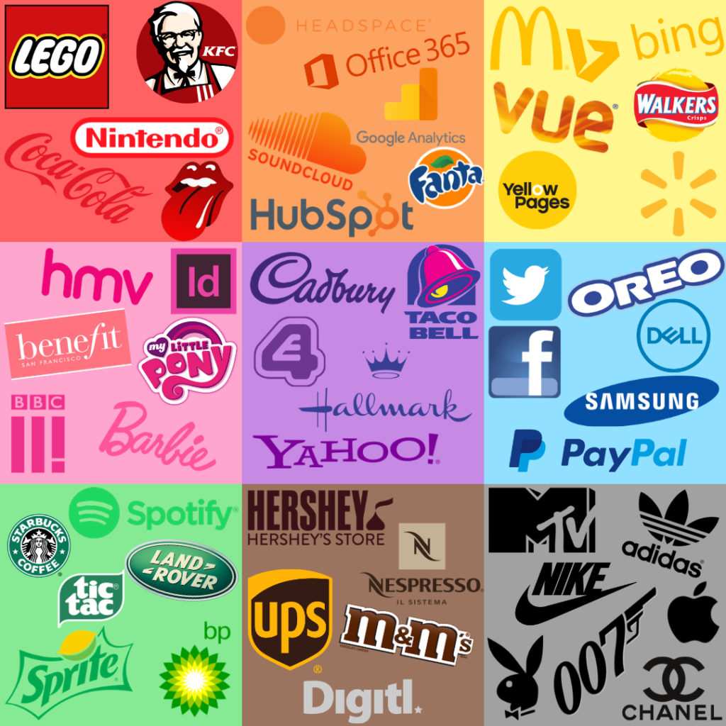
During the creative process, it’s good to stick to your branding – but it’s equally important to understand the basics of colour psychology and how they can maximise the impact of your banners.
Here’s a basic rundown of what each colour represents and how it may affect your eCommerce store:
- Yellow – optimism, energy, treasure, hope, life, cheerfulness, happiness.
- Orange – creative, friendly, enthusiastic, joy, warmth.
- Red – passion, speed, love, fire, excitement, urgency, violence, aggression, strength.
- Purple – royalty, luxury, wisdom, dignity, status.
- Pink – impactful, caring, romance, femininity, calm.
- Brown – relaxation, luxury, nature.
- Green – growth, rebirth, nature, prosperity, abundance.
- Blue – strength, tranquility, assurance, trust, responsibility, intelligence.
- Black – bold, powerful, confident, sophisticated, emotion.
- White – balance, pure, innocence, cleanliness, efficiency.

Content
When it comes to the text that will add the informative aspect to your banner, we recommend 3 key ingredients.
Firstly, the banner should include your logo. This is important for brand awareness purposes. Out of the three ingredients, however, the logo should be the smallest.
The second aspect is a compelling call-to-action (CTA). A banner should have a purpose that is consistent with the goal of your business. Where do you want your customers to go? Within the world of eCommerce the most common banner CTA is usually a ‘shop now’ button.
Finally your banner should be your business’s value proposition – what does your company do? What makes them unique? Convince your customers to choose you over your competitors. One way of doing this is by boasting about recent customer reviews. Research shows that reviews are a huge factor in driving conversions since approximately 61% of customers refer to reviews before purchasing a product.
Whilst it’s important that your banner incorporates all three aspects, having an easily readable banner is also important. For this reason, we recommend having a maximum of 4 lines of text – if you go higher than this your website visitors are quite simply not going to read any of it.
Another key consideration is accessibility for all users. For this, you may wish to think about your text size and colour. If you want to take your banners to the next level you could also incorporate some personalisation by showing users tailored products based on their past on-site behaviour. Currently, only 30% of businesses utilise personalisation on their website, so being one of the first to adopt this could be really beneficial.
Carousel/Animated Banners
If you’ve done your rounds on the internet you’ll have probably come across a website that has a rotating/carousel website banner.
With the ability to communicate several messages to your customer, it’s easy to understand why you may wish to implement a rotating banner on your website.
However, in practice, they are often a wasted effort. Research shows that rotating hero banners aren’t actually that effective. A study by Notre Dame University shows that the first image receives 84% of all clicks, so images after that will rarely get noticed. What’s more, they can diminish your customer experience by increasing your website load time, and as we know customers are becoming more and more impatient!
Despite this, if you still want a rotating banner, our top tip is to include no more than 6 images. Evidence shows that if we are shown more than 6 products our brains automatically switch off because the choice is too demotivating.

With this in mind, you’re not armed with all the tools you need to set about creating your own website banners. We hope you found this guide helpful, if you’re thinking about giving your business a boost by investing in a new website get in touch!


